When it comes to vehicle wraps, there’s one main rule to keep in mind — the design must be understood.
Factors like vehicle type, color, size, and font all play a role in this equation. And while there isn’t a tried-and-true, always-going-to-win formula, there are some best practices to follow when choosing fonts for your vehicle wrap.
Consider Speed
Remember that drivers are often traveling in excess of 60mph. As such, they’ll get a fleeting glance at your vehicle at best, especially if you’re traveling in the opposite direction. This doesn’t mean we should disregard this traffic. Rather, we can plan strategically for it by choosing fonts for your vehicle wrap that are extremely readable.
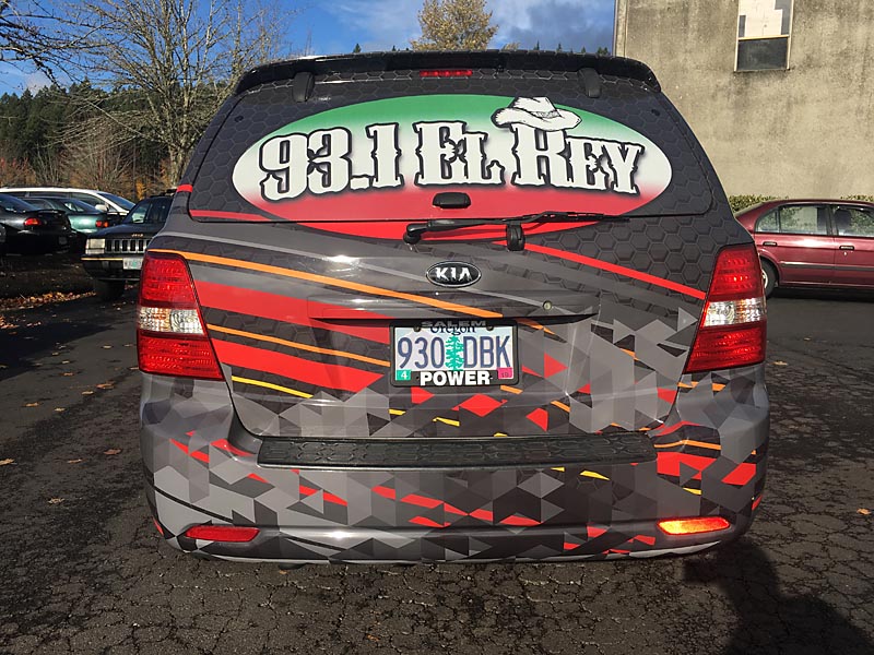
Sans Serif fonts work best for vehicle graphics.

While it may be tempting to use a unique, complicated font for your vehicle wrap message, this type of font greatly hinders readability. But first, let’s talk about serif and san serif fonts. Serif fonts have a small tail or stroke at the end of each letter. This extra embellishment makes them easier to read within large amounts of text, because the serif leads the eye along the line. On the other hand, sans serif fonts lack embellishment of any sort. This makes san serif fonts easy to discern, especially at a glance.
At 60mph down the highway, future customers will easily identify who you are and what you’re about more easily if you use a sans serif font for your vehicle wrap. This is great, because readability is the most important job of a vehicle graphic.
Appropriate spacing is important.
Keep letter spacing fairly typical. In other words, don’t try to be clever or unique in how you space your letters and words on your vehicle graphic. Fonts that are spread widely apart or squished together closely are more difficult to read.
Reverse text on the hood.
Hood graphics are typically seen in the rearview mirror of the car in front of you at a traffic light. Or as you approach to pass another vehicle. Anticipating this perspective, it makes sense to reverse the text and graphics on the hood.
Consider Size

We generally consider larger fonts easier to read. But even in this assumption, variables are at play. A complex font will be more difficult to read than a simple font, even if it’s larger. Any font that uses both thick and thin lines will be more difficult to read. The Center for Inclusive Design and Environmental Access provides some general guidelines to keep in mind:
- 3” letters can be read up to 25 feet away
- 6” letters can be read more than 33 feet away
The United States Sign Council put together a formula for signs to be viewable by a moving vehicle:
VRT (viewer reaction time) + MPH/800 = recommended square footage for a stationary sign
The United States Sign Council
Keep in mind that when the sign and the viewer are both moving, it gets a little more complicated. Overall, it’s best to make the design and fonts for your vehicle graphic as simple as possible.
Consider Color
One of the most useful, effective tools in vehicle graphic design is color. Bright colors catch the eye and make a bold statement. Remember that the color you use as the base for your design, whether the vehicle itself or a full vinyl wrap, will often be the background color for your font. The higher the contrast between the font and the background, the easier it will be to read.
- White text on a black background is very legible
- Red text on a black background isn’t nearly as legible
Whatever your brand and business, choosing the right fonts for your vehicle wrap design can make a big difference. If you’re unsure how to convert your brand into a meaningful, actionable vehicle wrap design, let’s talk about the possibilities. We specialize in supporting your business in variety of creative, effective ways.